Design Projects
A selection of freelance projects.
Vaalia Sauna House
Vaalia brings the ritual of sauna culture to any location, offering a restorative escape in nature. The brand identity blends Scandinavian minimalism with organic textures, balancing warmth and structure. A natural color palette—charcoal, steam, and timber—evokes fire, water, and relaxation.
Designed for seamless integration across digital and physical touchpoints, Vaalia’s identity transforms it into more than just a sauna—it’s an immersive, mobile retreat.
Brand Identity


Folia Herbals
In 2024, I collaborated with Folia Herbals to reimagine their visual identity, focusing on a new logo, brand mark, and color palette. These updates reflected their dedication to plant medicine and holistic health. The project captured the essence of nature and simplicity, laying the foundation for a fresh and meaningful brand presence.
Brand Identity


Bambi Soulcare
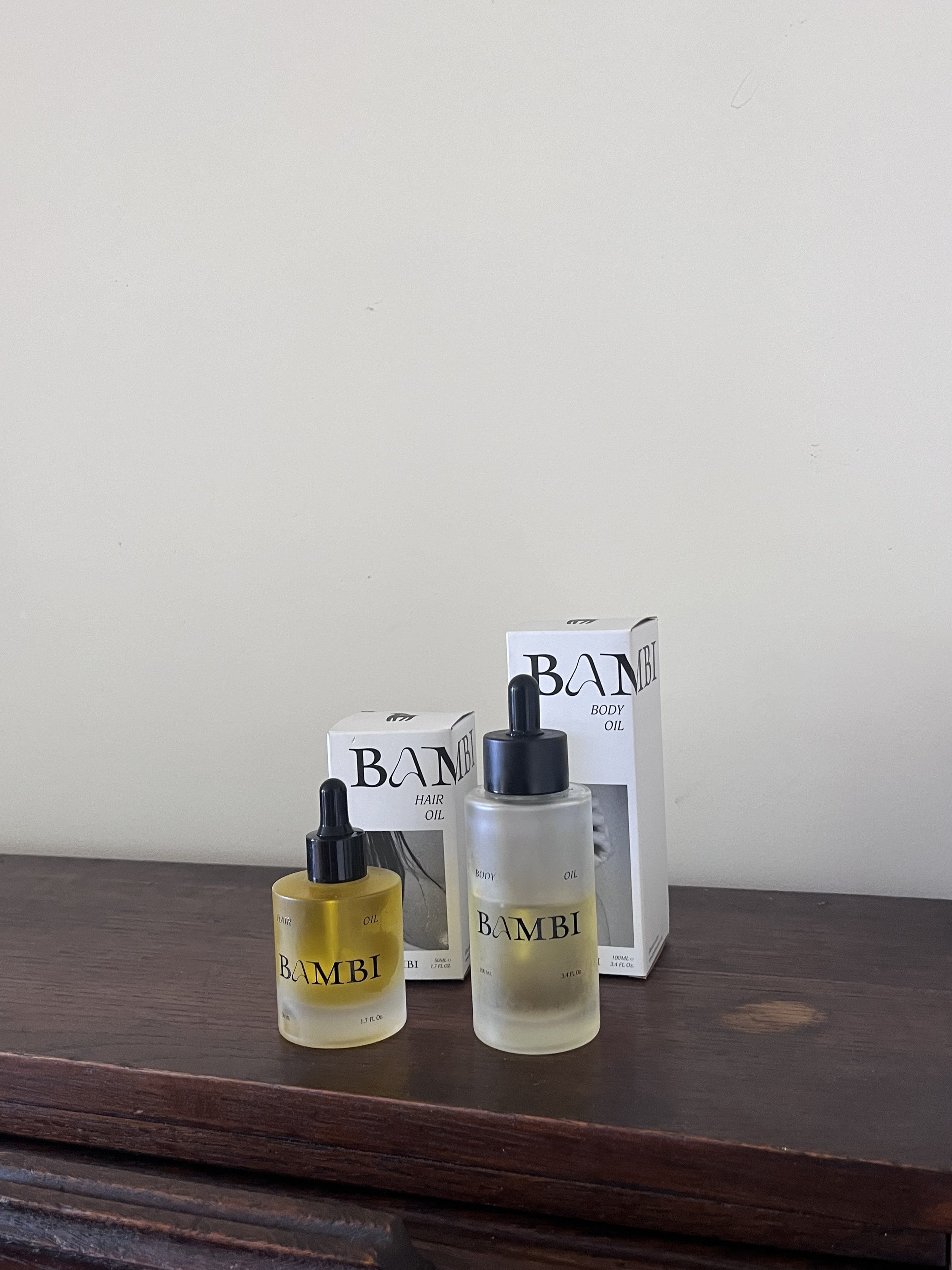
My 3-year collaboration with Bambi Soulcare kicked off with a captivating day-long photoshoot on Salt Spring Island, finding inspiration in its golden landscapes and pristine lakes. This memorable day sparked conversations about packaging and design and enhancing the brand's identity. In the spring of 2022, we embarked on a comprehensive transformation journey, revamping the brand's identity, packaging, print materials, and website. To mark the launch of the new products & branding, we organized a summery lakeside photoshoot, that highlighted the new bottles & golden oils. This project has been a labor of love and a remarkable journey of personal and professional growth.
Print Material | Brand Identity | Packaging | Photography
Packaging Design
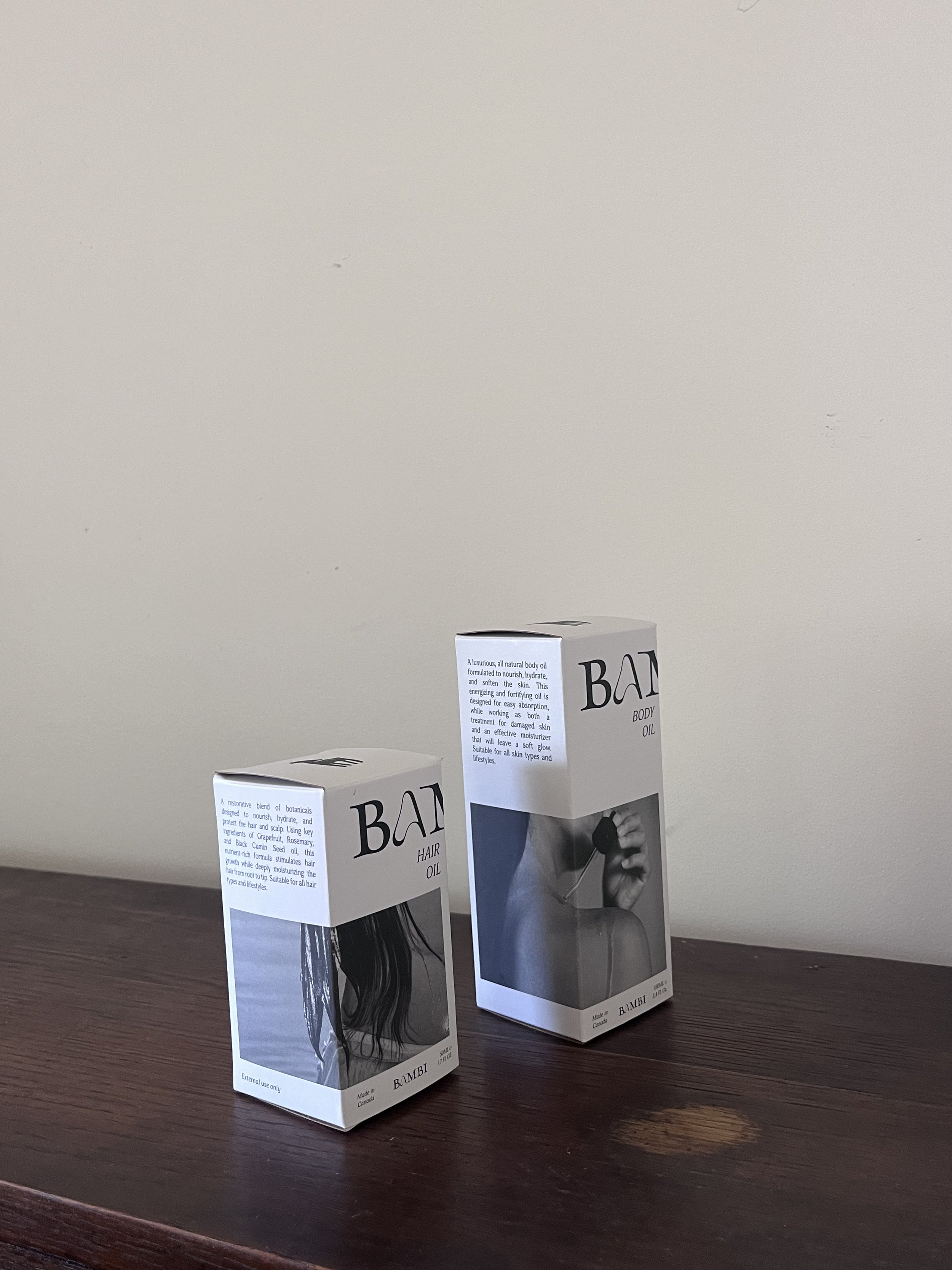
Packaging Design
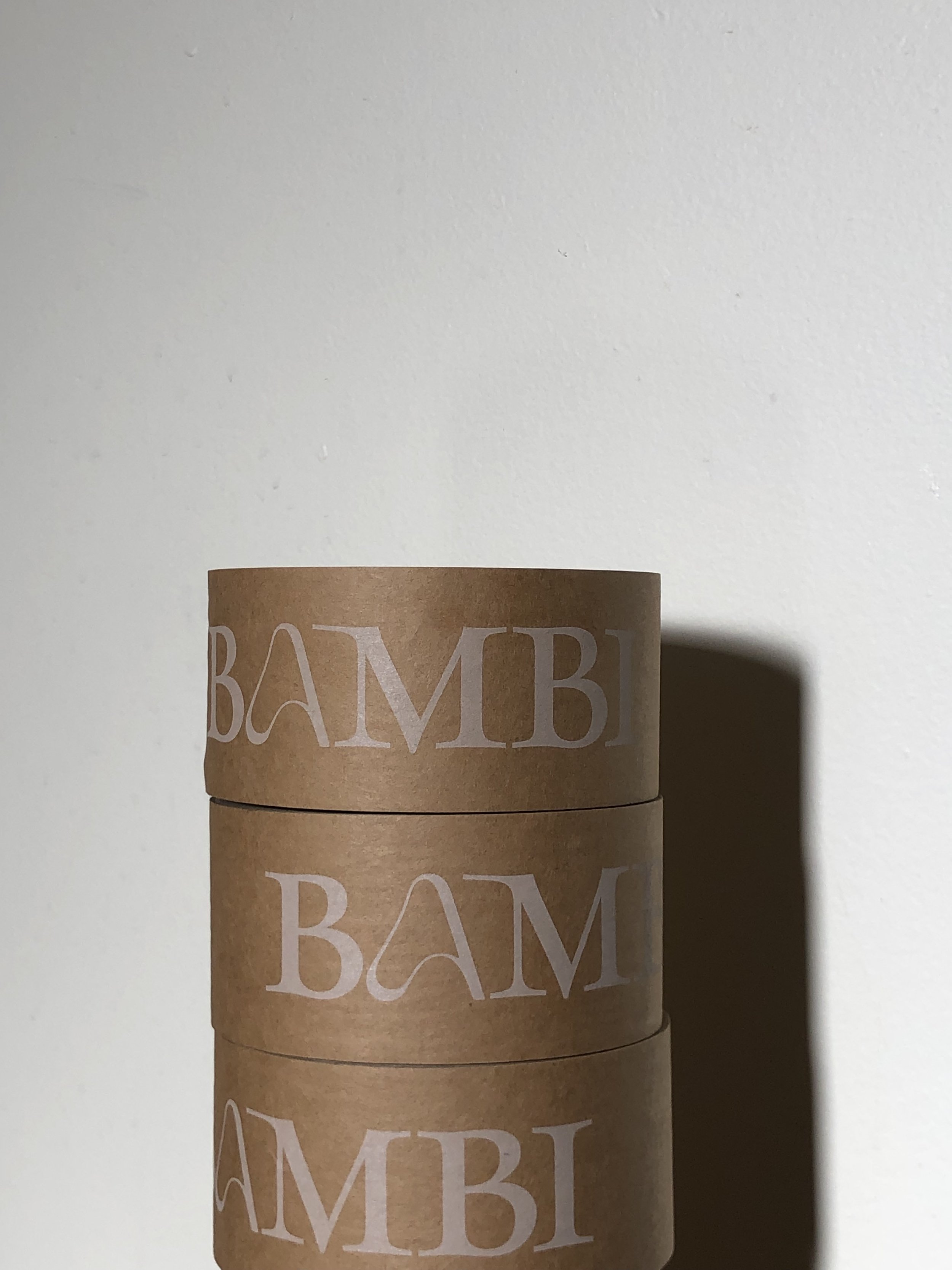
Branded tape
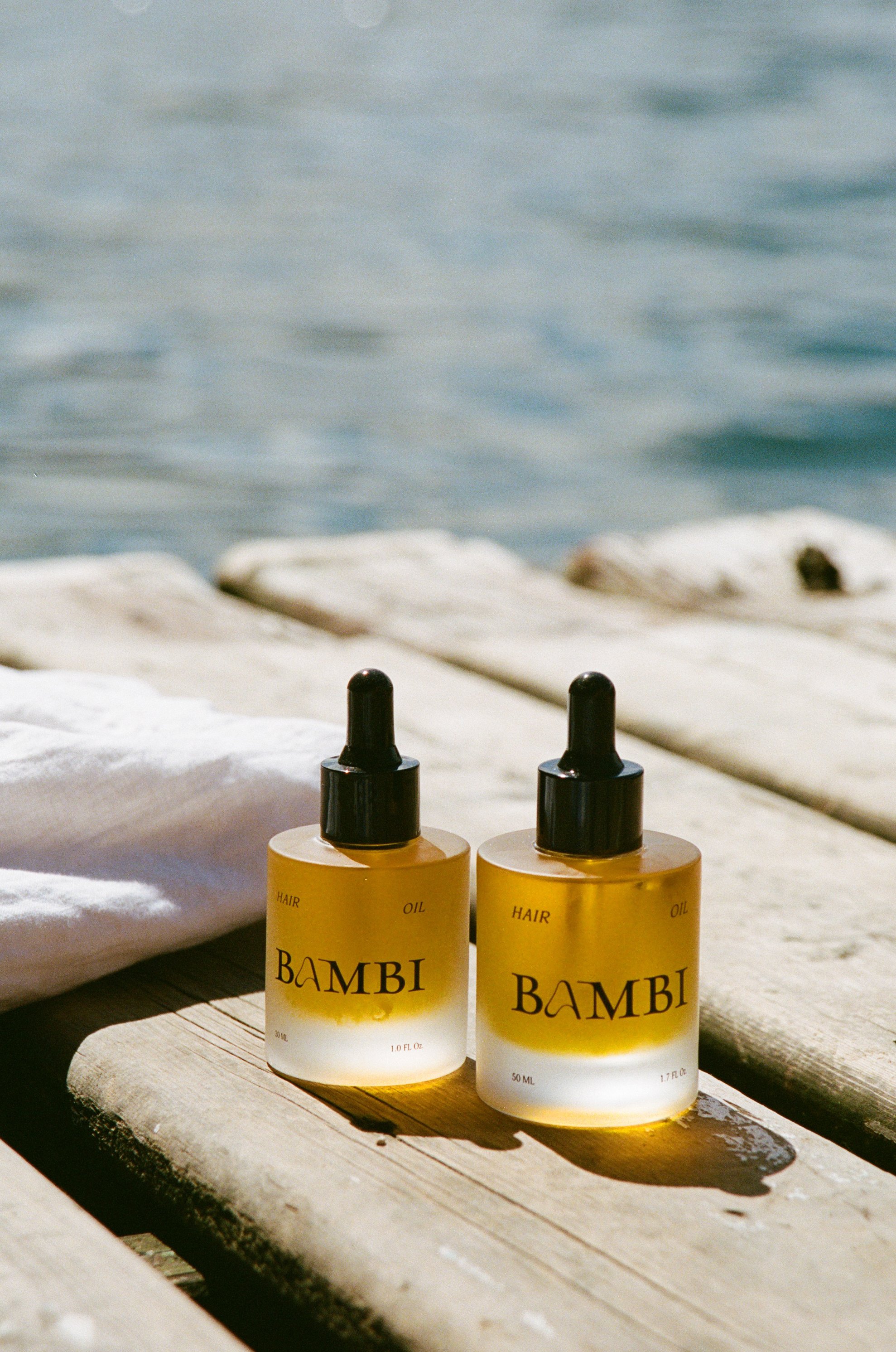
Product photography
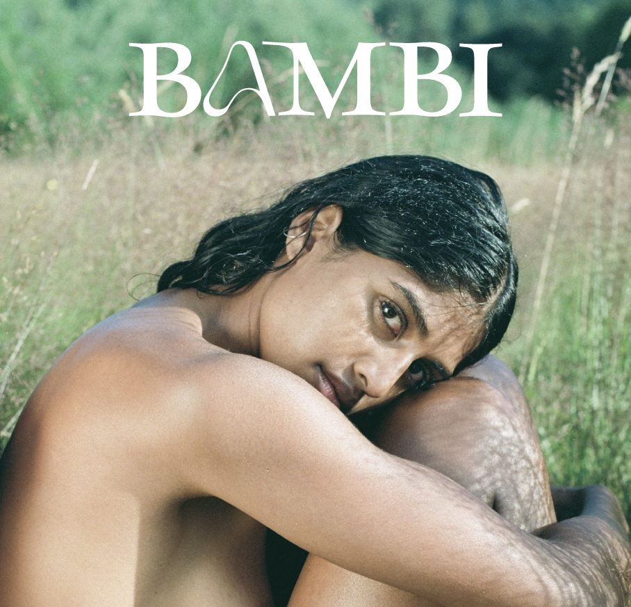
Logo design & photography
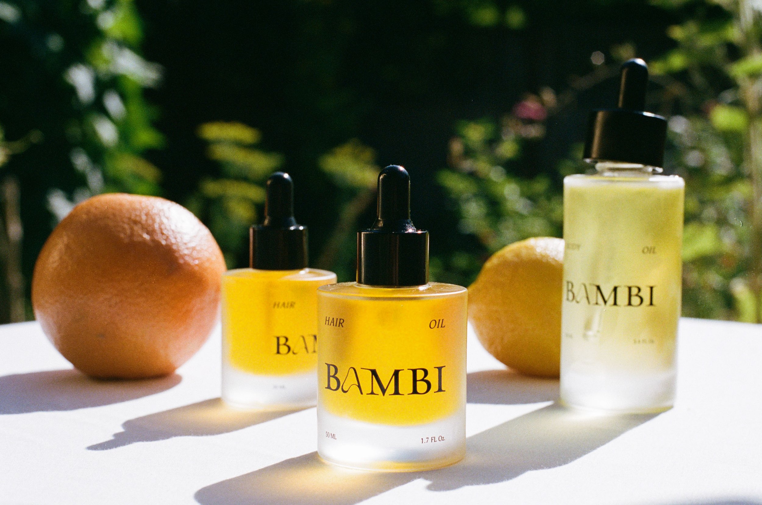
Product photography
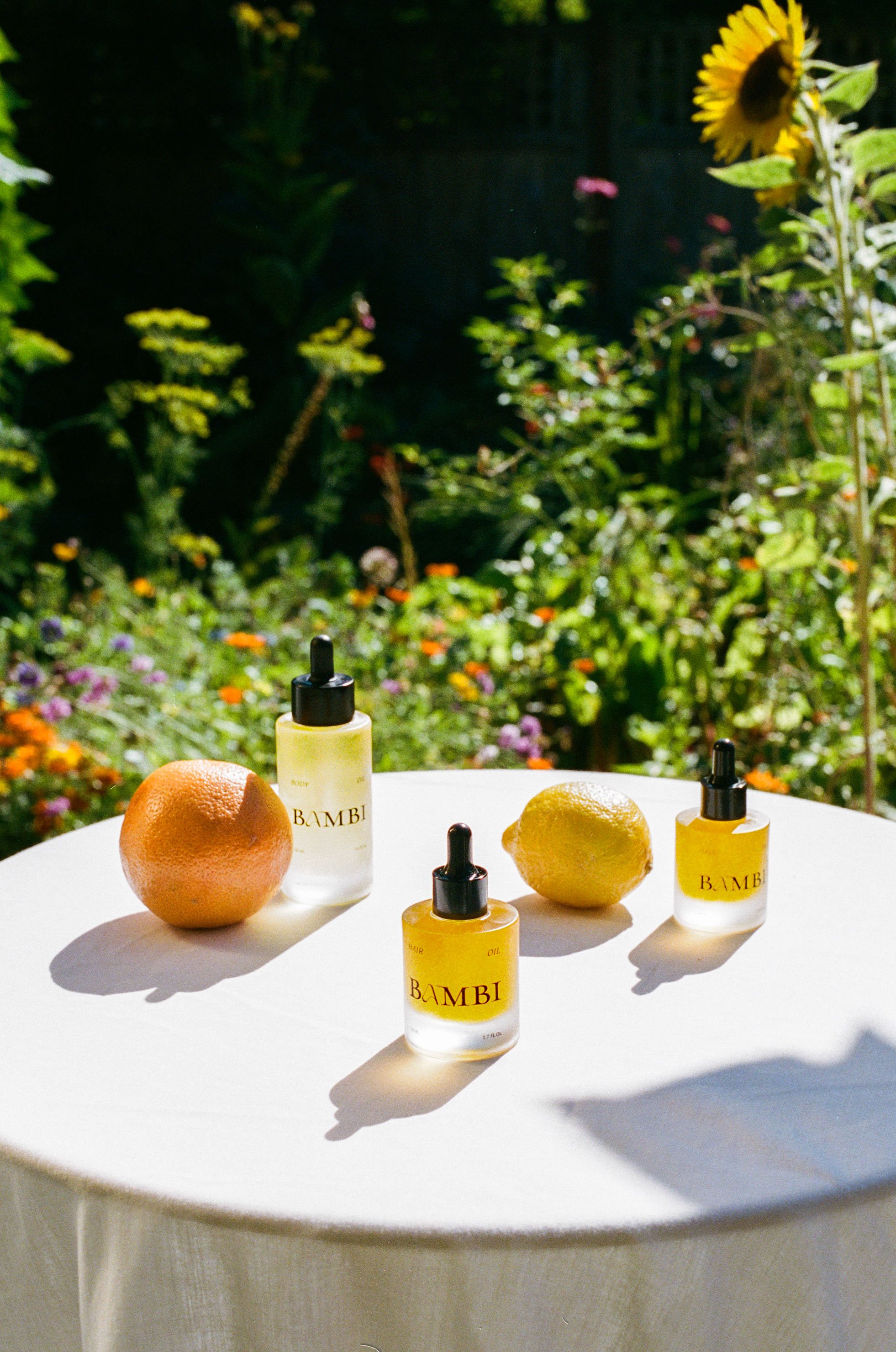
Product photography
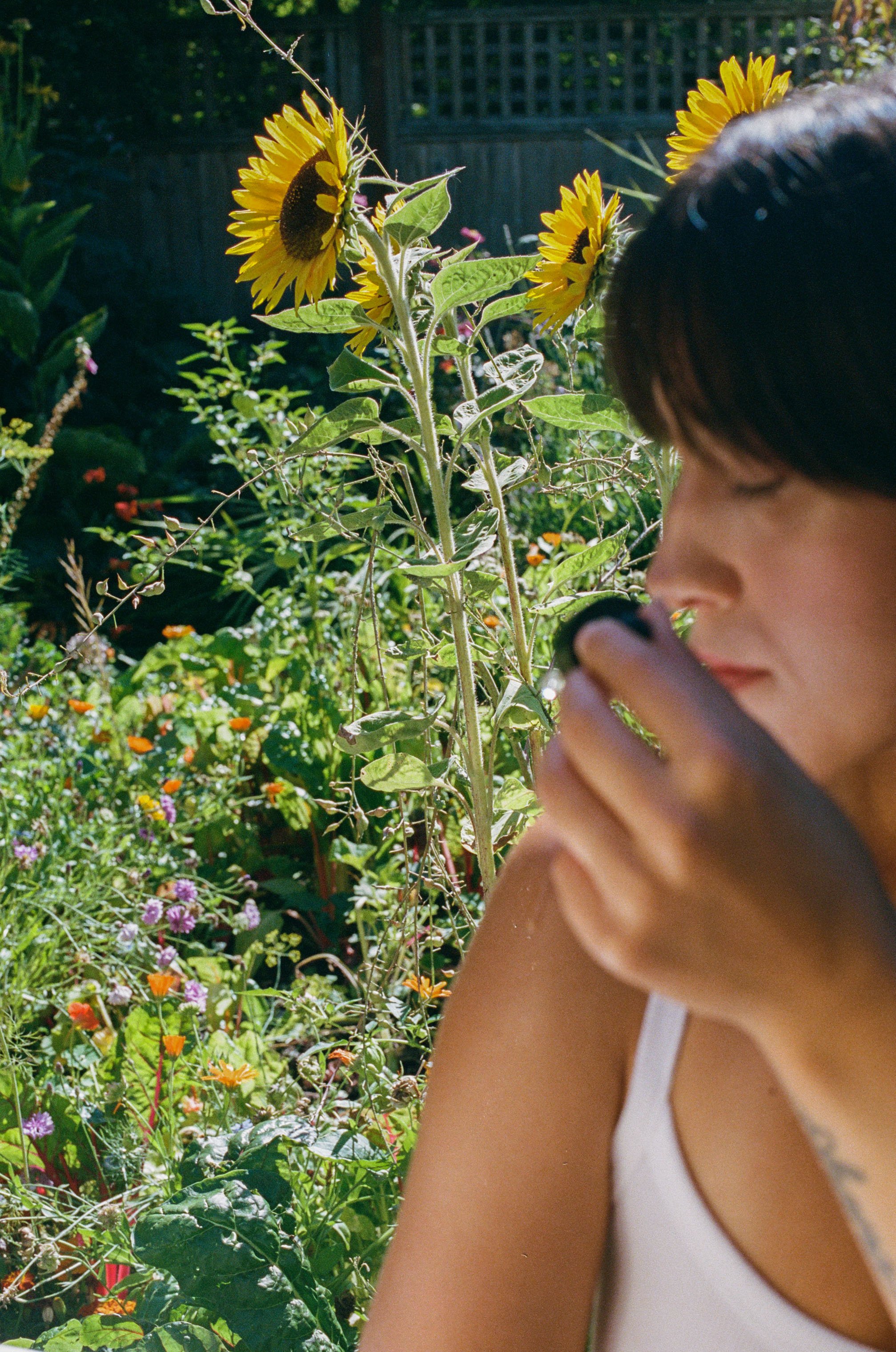
Lifestyle photography
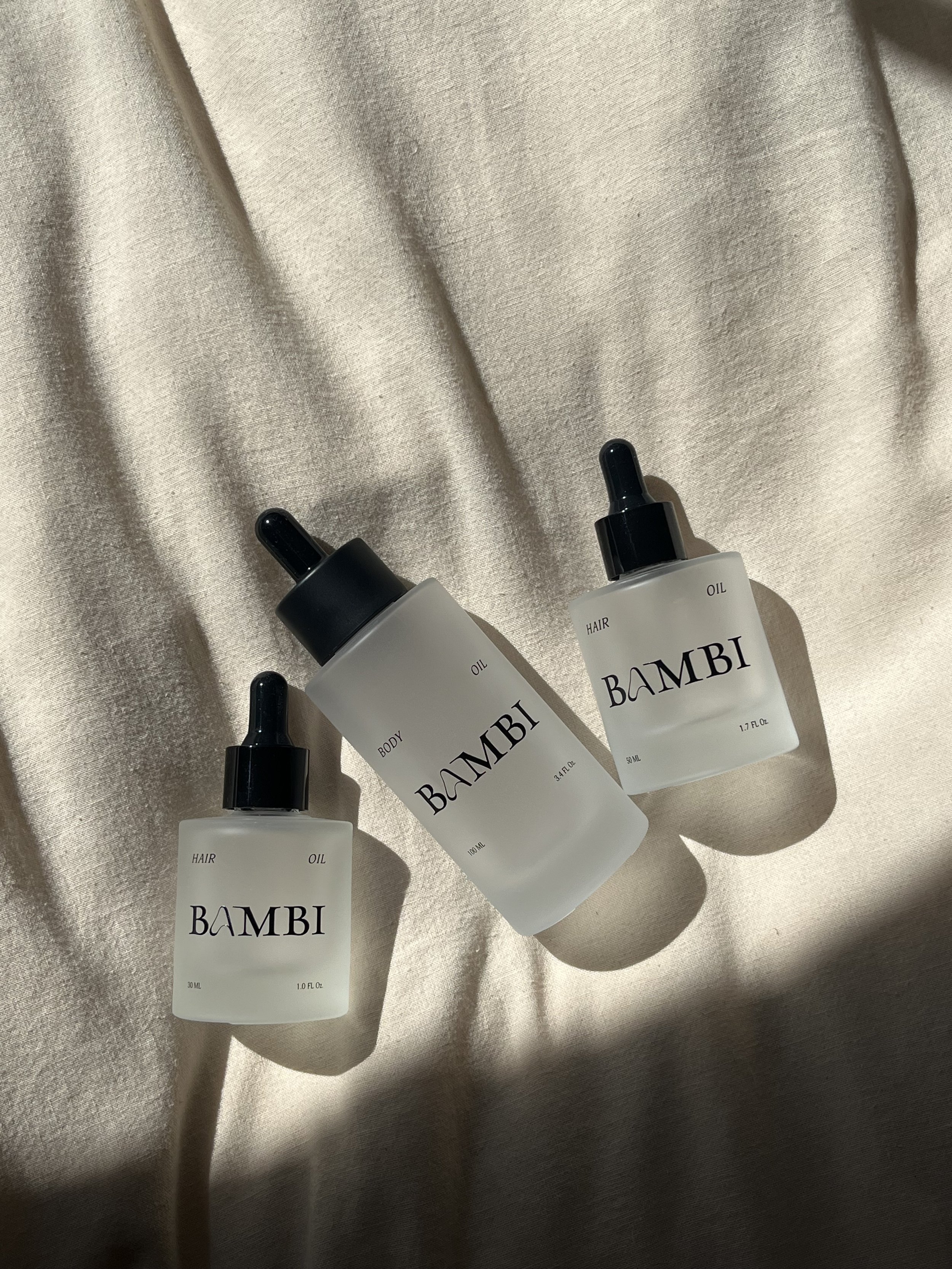
New bottle designs
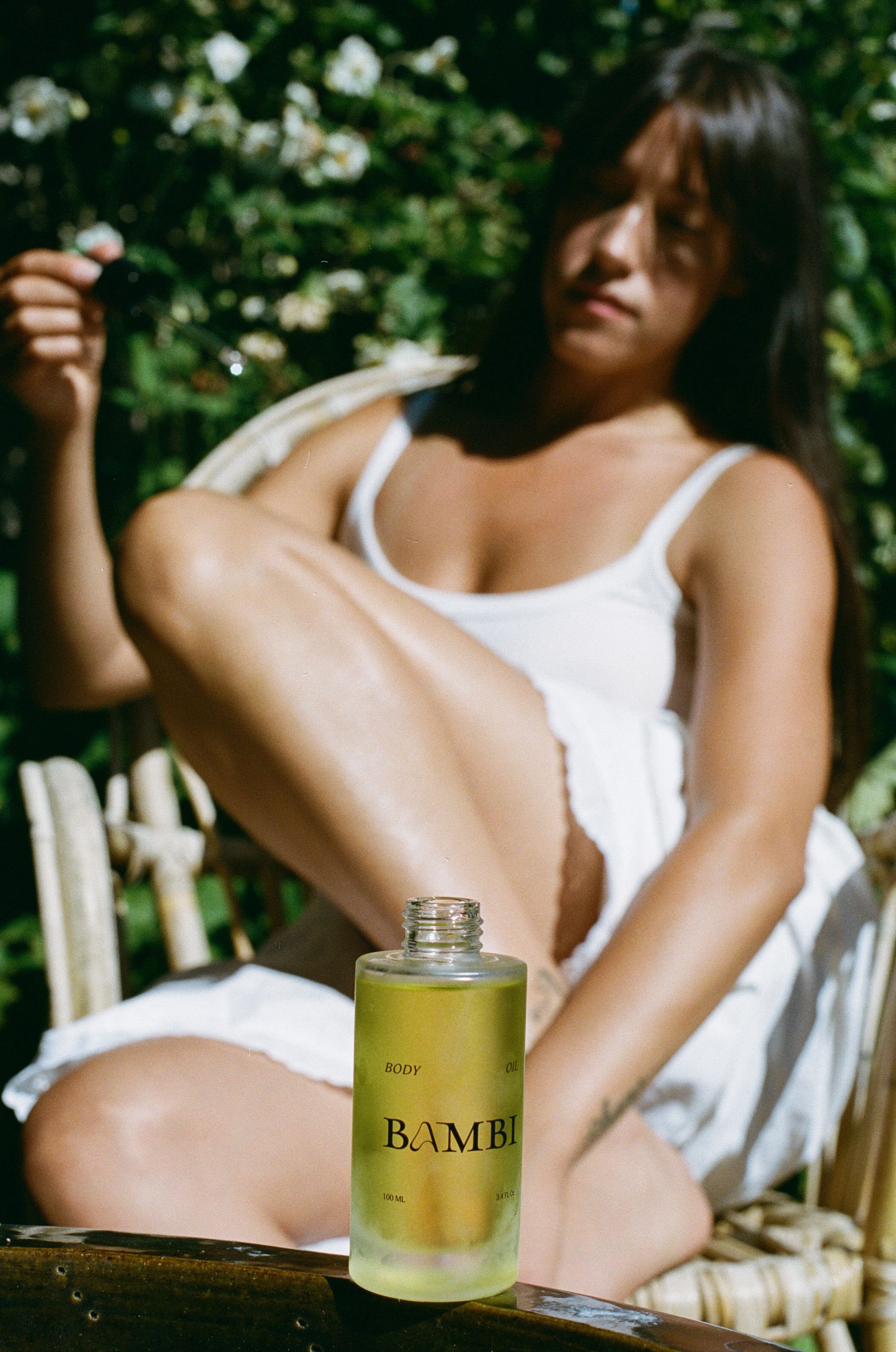
Product photography
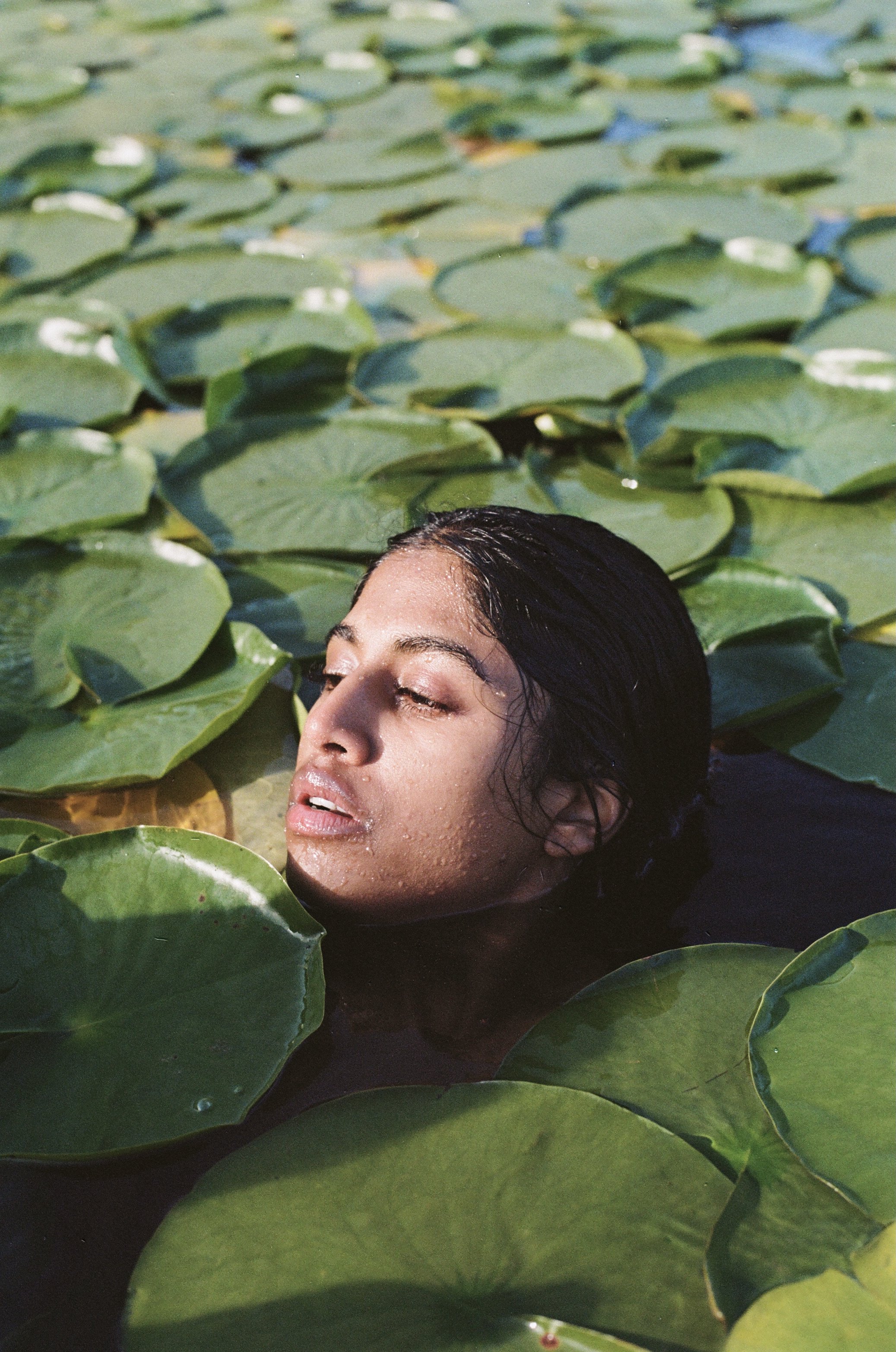
Lifestyle photography
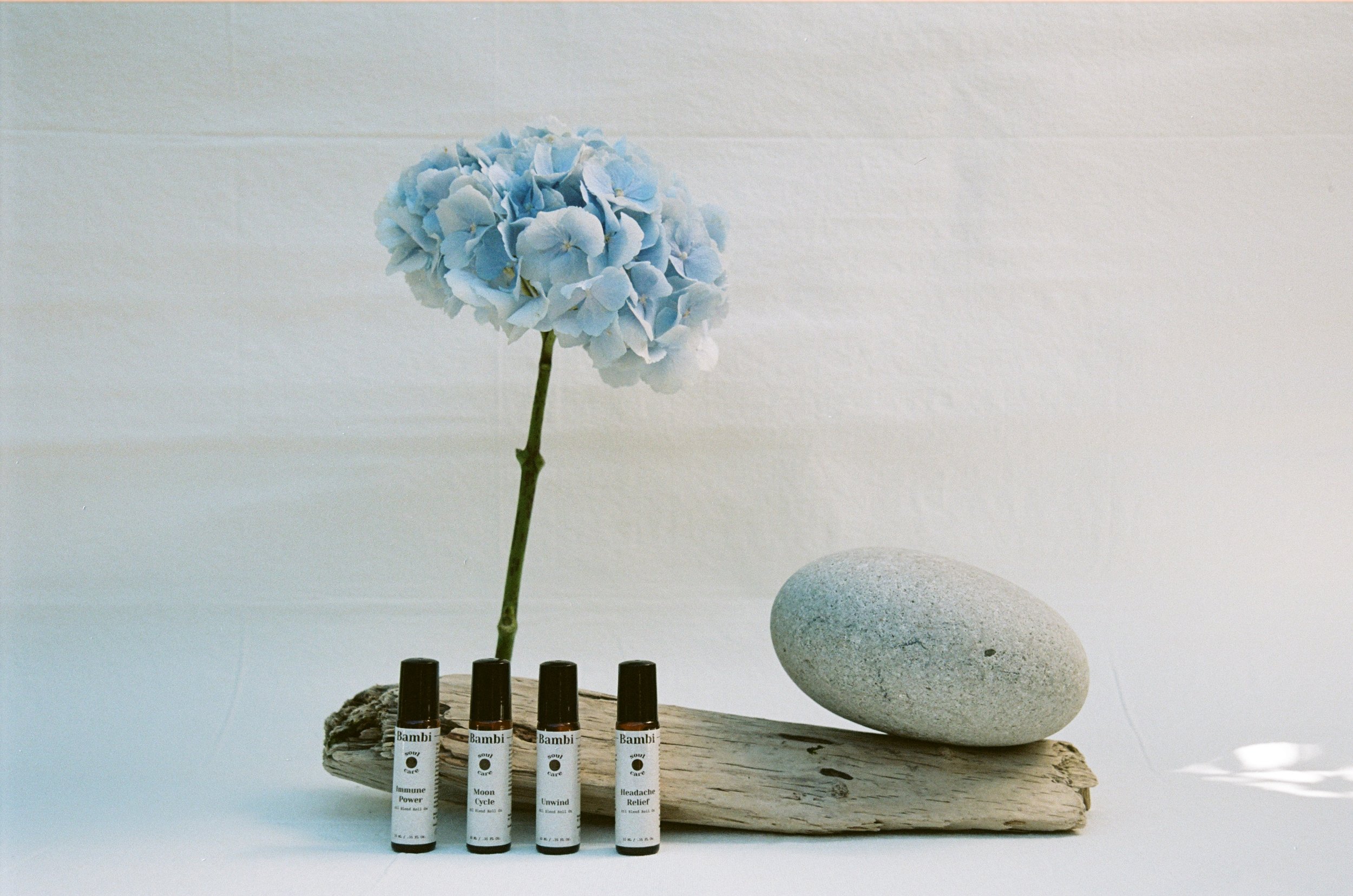
Product photography (prior to rebrand)
Plena Plena Tea
For this project was brought on to design and build a visual brand identity and then translate that into product packaging. Plena Plena is a plant-made loose-leaf tee brand, that draws inspiration and colour from all things natural. She wanted to embrace the vibrancy and reject the neutrality that she was seeing in branding. This project included a lot of colour study. We wrapped up the project with a delightful tea party-inspired film photoshoot & some sunny backyard product photography/ portraits.
Illustration | Brand Identity | Colour Palette | Photography

Packaging design & photography

Lifestyle photography

Packaging design & photography

Packaging design & photography
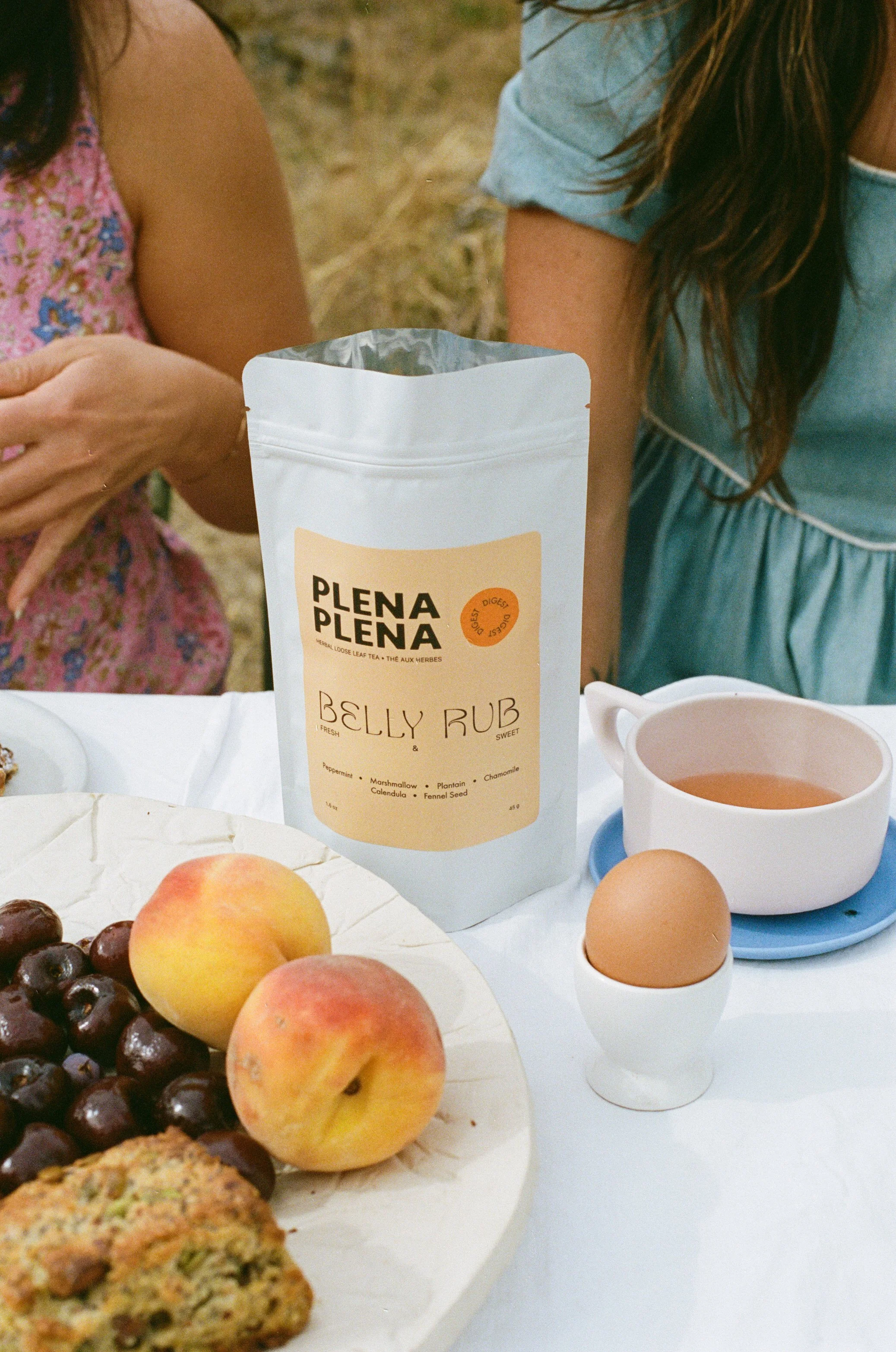
Packaging design & photography

Packaging design mockup

Packaging design mockup

Colour study (blues)

Colour study (greens)

Colour study (yellows)

Colour study (blues 2)

Colour study (reds & pinks)
Chuck be Hungry
For this project, I was asked to design a colourful and vibrant brand identity inspired by Italian cooking, picnics, and iconic food packaging. This brand identity would be used for an online cooking blog, content, and social media.
Illustration | Brand Identity | Templates

Logo variation

Logo variation

Logo variation

Logo variation

Illustration

Illustration

Recipe template

Illustration

Illustration

Logo variation

Logo variation

Logo variation

Logo variation
Illustration

Brandmark

Brandmark variation

Illustration
Logo variation

Logo variation
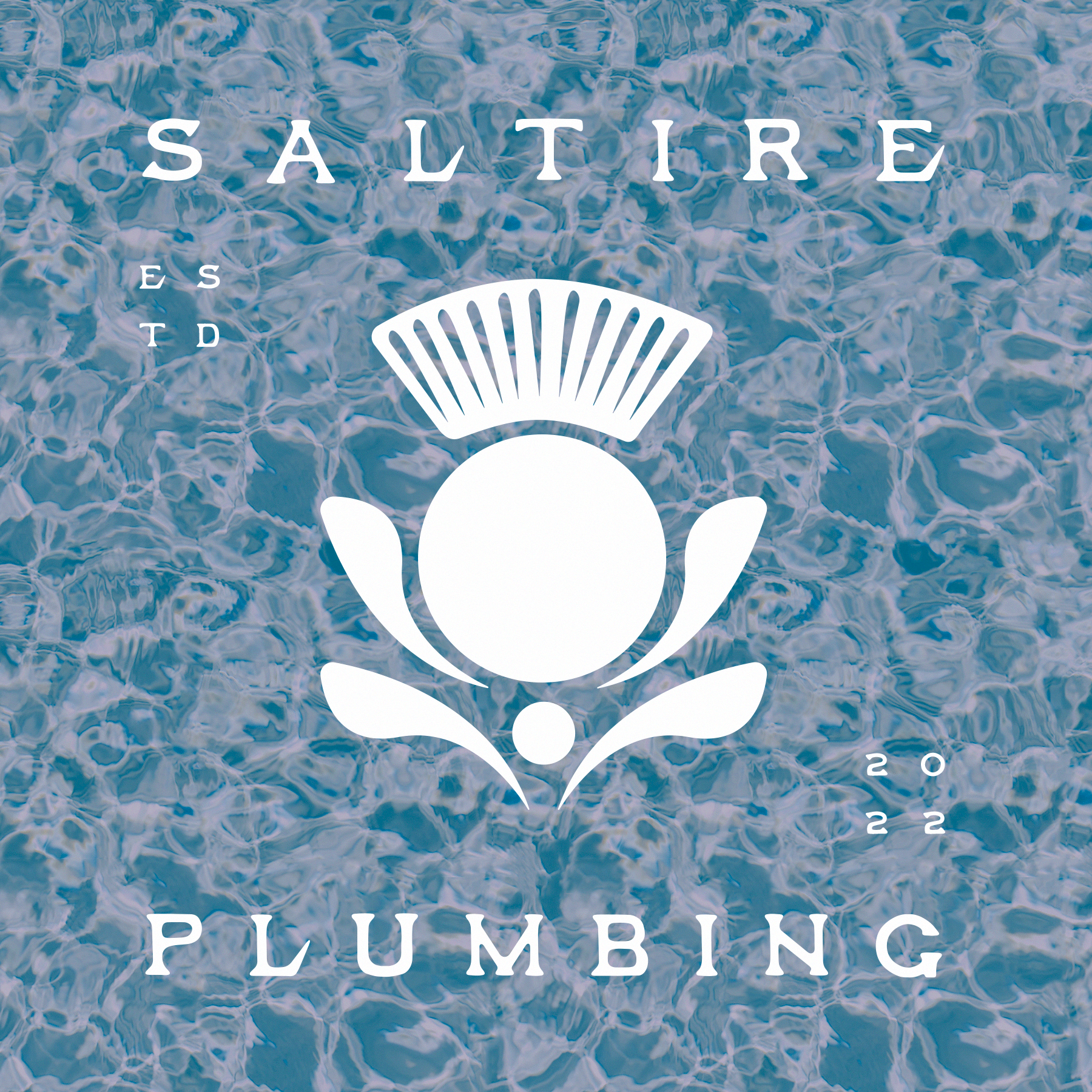
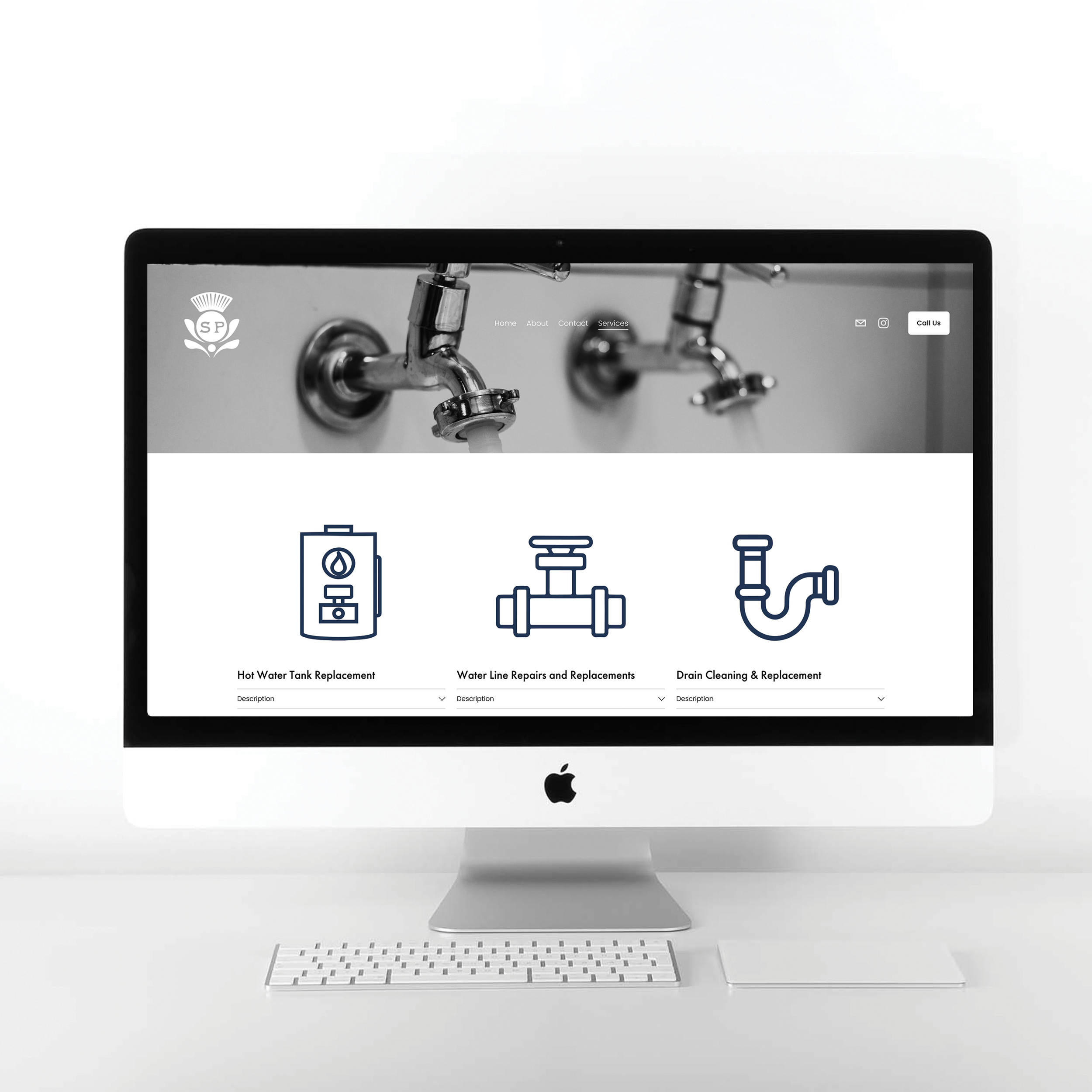
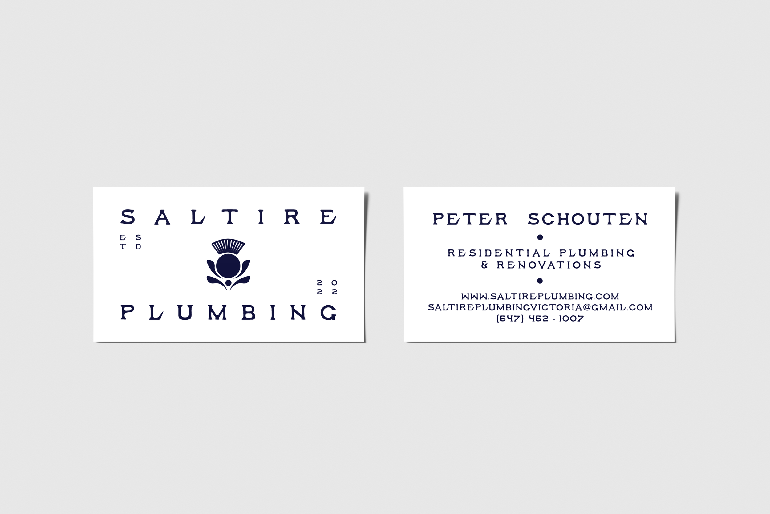
Saltire Plumbing
Peter lives in Victoria, BC, and started his own plumbing company this year, to streamline new clients and create a digital space that detailed his services, contact, and presence he asked me to design a logo and subsequent brand identity, as well as create and design his website. The goal for the website was for the information to be presented clearly, as most clients are just looking to see what services you can offer and how to get in touch. A saltire, also called Saint Andrew's Cross or the crux decussata is a heraldic symbol in the form of a diagonal cross, like the shape of the letter X in Roman type. Peter is Scottish and wanted to nod to his heritage with the name and iconography of his company, therefore we used a modern simplified thistle in the logo design.
Website | Brand Identity | Print Material
Salty Surf Sisters
For this project, I was asked to design a brand identity that illustrated a fun and open surf club for women. The goal of the surf club is to create an environment that encourages women to surf and build a community around this. My client wanted the primary logo to include an illustration of a woman surfing and for it to have a warm, inviting, and natural vibe to it.
Illustration | Brand Identity

Primary logo

Logo variation
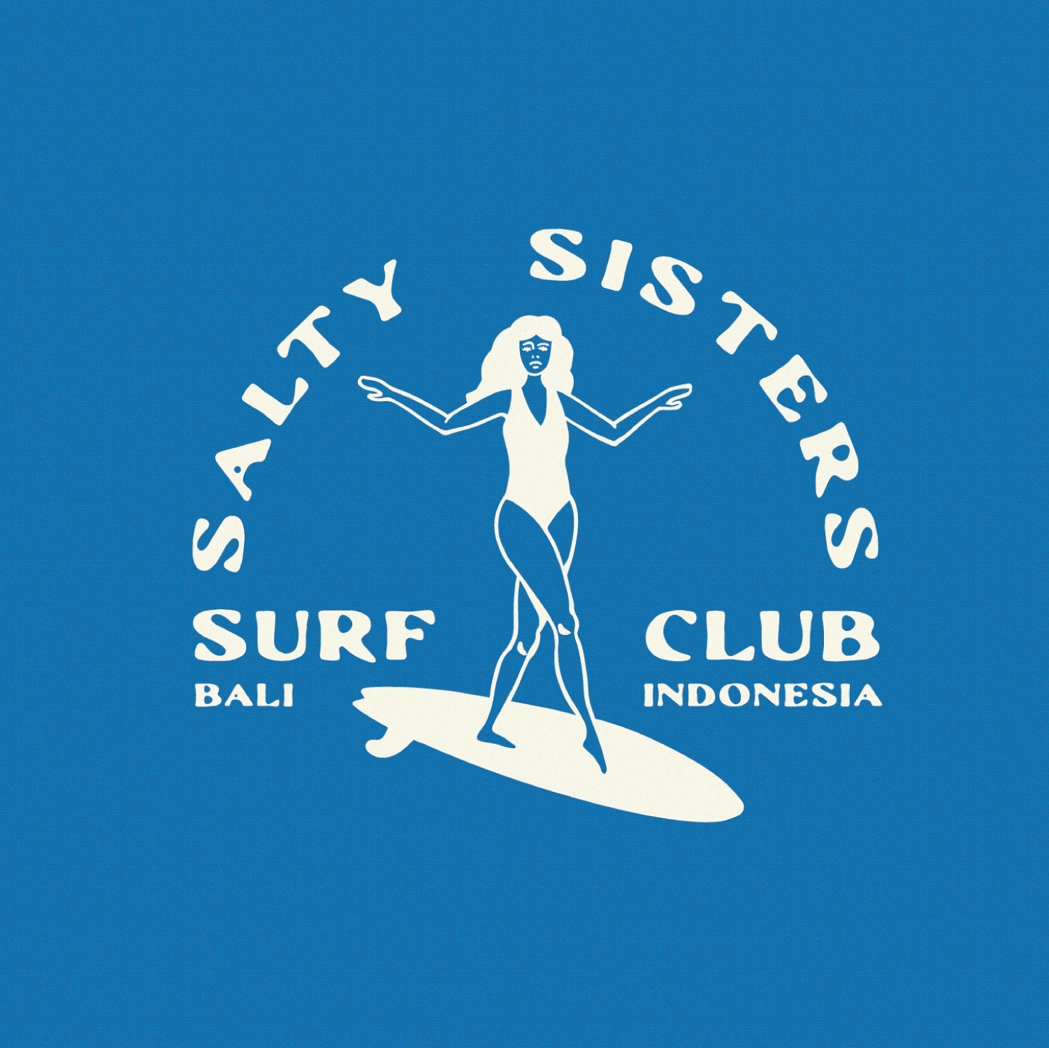
Logo variation
STC: Coffee & Bagels
STC, sought my expertise to guide their brand transformation from a traditional dine-in café to a bustling deli-style bagel and sandwich shop. Nestled at the heart of the city, this newly imagined café is poised to captivate the taste buds and create an unforgettable dining experience. Leave ordinary behind as STC invites its patrons to relish in freshly baked bagels, lovingly prepared sandwiches, and an array of delectable spreads. Embodying a harmonious blend of modern charm and old-world nostalgia, STC embodies the intimacy of a delicatessen, where every ingredient is meticulously selected to tickle the palate and leave a lasting impression. Prepare to unfold a journey through flavors as STC revolutionizes the traditional café scene and ushers in a new era of the bagel and sandwich culture. Deliverables for this project were the new logo, and accompanying print material (menu, stamps, stickers etc.)
Print Material | Brand Identity | Illustration


Kelly Bohlken Art
The brief for this project was to capture some film photographs of Kelly’s work, and some portraits of her as an artist, and showcase the art she creates, the commissions she has done and allow people to contact her in a simple and easy fashion. I created this website with the intention that all the focus would be on the art, meaning lots of space, neutral tones and simple type.
Website | Photography
The Budding Elm
This project brief was pretty multidimensional, it was a rebrand, a new website, and photography. The goal was to completely redo a website that didn’t function properly, and that ultimately wasn’t clear and create a website that was clear, concise and conveyed information, options and contact clearly and efficiently. As a counselling website the tone needed to be comforting and calming, we decided to continue with the Elm tree icon, as the client loved it, but make it modern, fresh and simple. All the content on the website was changed and updated to minimize clutter and remove repetition, all headshots were redone to create uniformity and professionalism.
Website | Brand Identity | Photography
Dune Bugs
Coming soon, this is the brainchild of my sister and I, a handmade clothing company, specifically towel ponchos for adults and kids. We are both avid sewers and creative clothing designers, we ultimately hope to build something together called “Dune Bugs”.
Brand Identity

Graphic Logo for Dune Bugs Variation 1
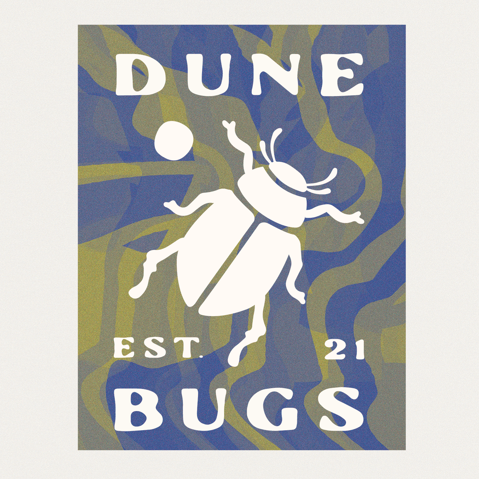
Graphic Logo for Dune Bugs Variation 2

Graphic Logo for Dune Bugs Variation 3

Illustration Series for Dune 1/4

Illustration Series for Dune 2/4

Illustration Series for Dune 3/4

Illustration Series for Dune 4/4

Brand Mark for Dune Bugs
Studs by Jess
Studs by Jess was a passion project for me, the goal was to design a graphic logo for Jess to share on social media as a means of getting the word out there. She started this project during the pandemic as a way to donate money to Black Lives Matter movements and other BIPOC organizations.
Brand Identity

Graphic logo for Studs by Jess

Graphic logo for Studs by Jess

Graphic logo for Studs by Jess

Graphic logo for Studs by Jess
Poster Designs
Here is a collection of posters I designed for various projects, they were all designed to be printed at 11x17 on matte paper. Two of the poster designs were for short films, with complex and intricate symbolism, so the brief was to try and capture the tone and pull on one specific theme. One of the posters was commissioned for the Victoria Film Festival 2022, as an exhibition local artists were asked to recreate film posters from iconic movies, which were then displayed around the festival. All illustrations and artwork are done by me.
Poster Design | Illustration | Typography

"Day of Sports" Poster for Sports Day on Saltspring Island

"Clay Pots" Poster for Short Film by Michael Makaroff

"Eternal Sunshine of the Spotless Mind" Poster for Victoria Film Festival

"Fitting in Places" Poster for Short Film by Michael Makaroff
Smokehouse Foundation
The Smokehouse is and has always been a symbol of resilience for coastal and remote communities across North America. From the seasons of abundance, preservation, and storage for all precious food resources offer safety and reassurance for when the cold winter winds approach. The brief for this project was to design a logo that represents the foundation and design a website that helps outline who they are, what they do and how they help. Ultimately the website created to be very simple and show potential investors how their financial support helps and what the goals of the foundation are.
Website | Brand Identity


