Folia Herbals
Brand Identity | Logo Design | Color Palette
Reimagining Folia Herbals’ visual identity with a new logo, brand mark, and color palette that reflects holistic plant medicine.
The Challenge
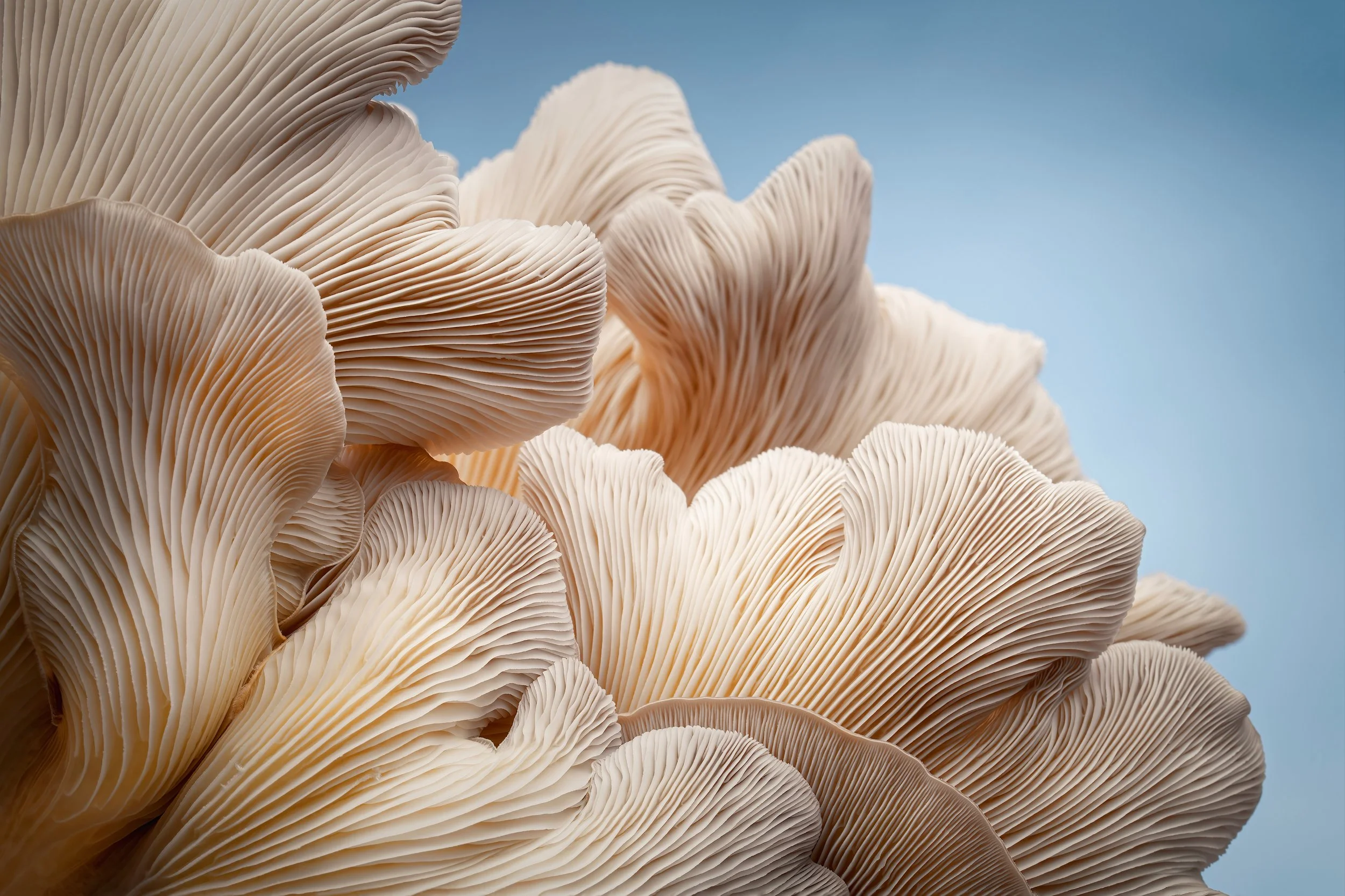
Folia Herbals wanted to refresh their visual identity to better communicate their dedication to plant medicine and holistic health. The goal was to create a visual system that was simple, natural, and meaningful—laying a foundation for a cohesive and engaging brand presence.
The Approach
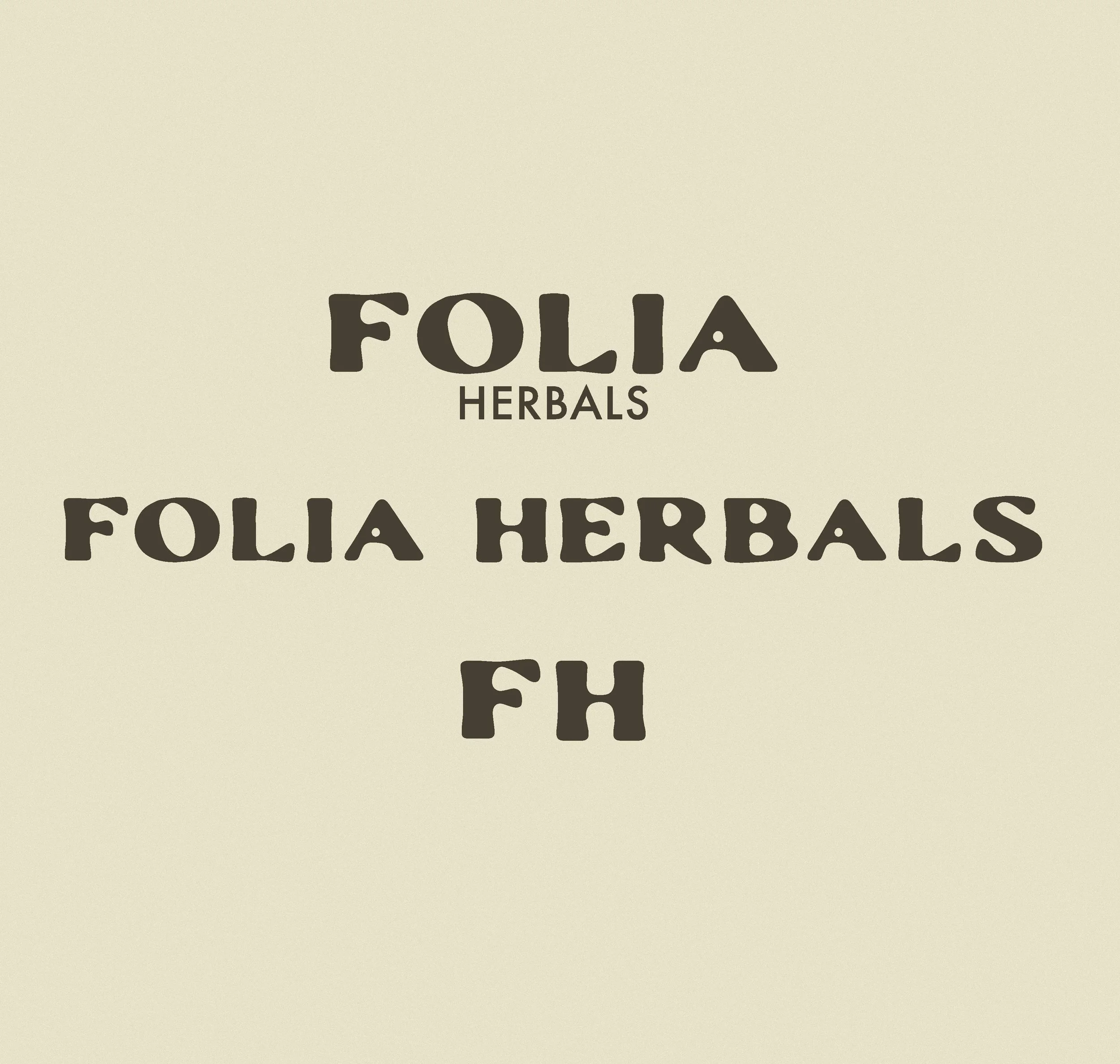
Logo & Brand Mark
Designed to capture the essence of nature and holistic wellness.


Colour Palette
Crafted to reflect natural, calming, and organic tones.


The Outcome
The refreshed visual identity gave Folia Herbals a cohesive and meaningful presence, reflecting their commitment to holistic health and plant medicine. The new logo, brand mark, and color palette provide a strong foundation for all future branding and marketing efforts.

“I appreciate you so much, thank you for all your hard work in helping bring this vision to life, I’m over the moon happy... I feel excited about my brand again”